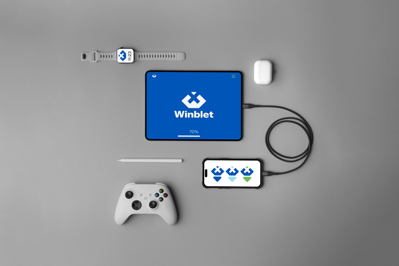
So for the final concept, I thought why not combine the idea from all the previous 3 concepts and merge them into a hybrid concept that not only serves as a separate dual-meaning logomark but also hidingly looks like the company’s main initial.
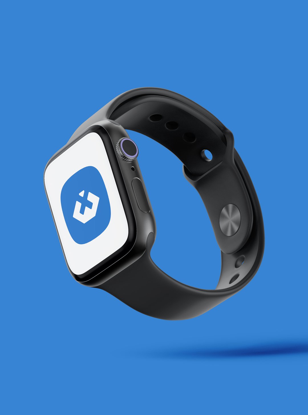
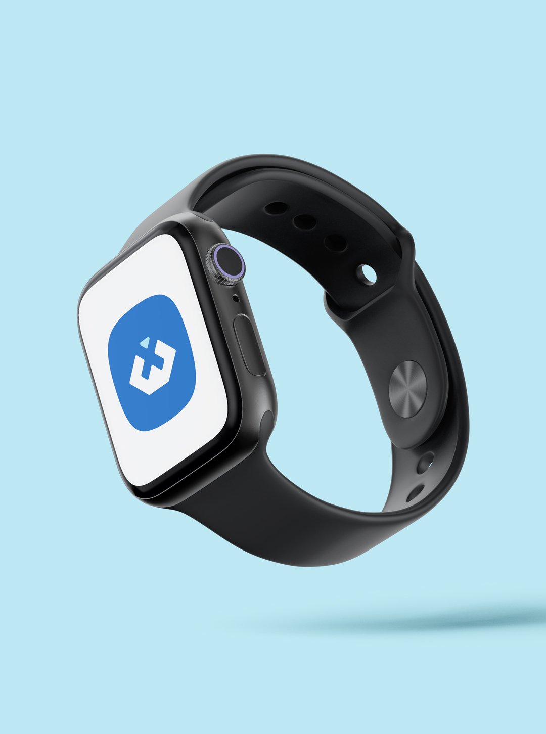
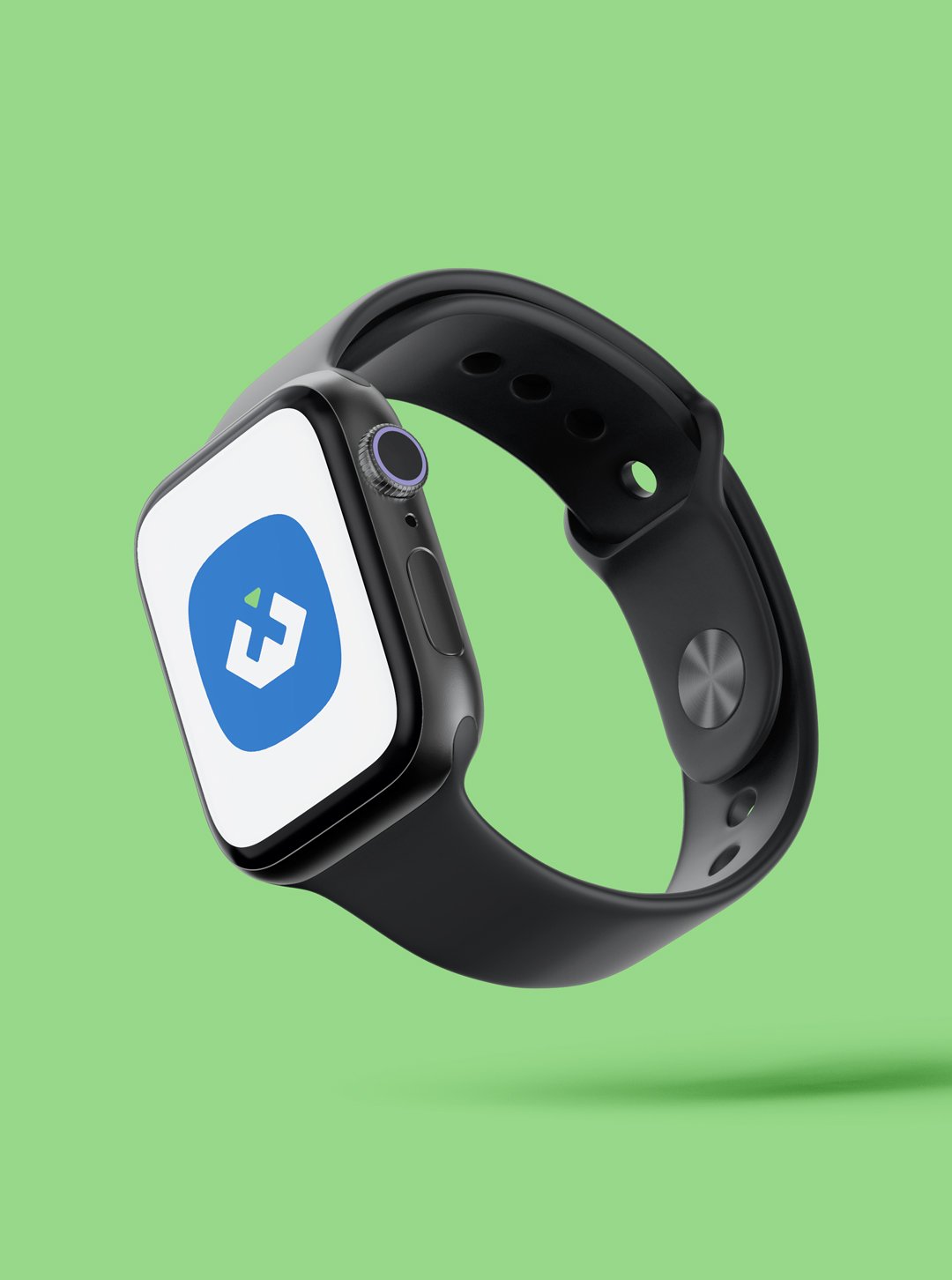
And it so happened that this mark came out of a portion of the game controller’s cross button to symbolise saving as easily as pressing the game play button that also happens to form the winning stance of a person holding a trophy, illustrated in minimalist style that also serves as a graphic that helps to differentiate the three Winblet entities by simply applying three meaningful colors: blue for the studio itself and for game studios, light blue for parents’ app and green for childrens’ growth app.